


3D Folded Blocks
With Esther & Geesje
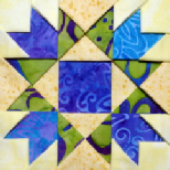
Fabric selection
Pick fabrics that hold a good crease when pressed, and aren’t too thick to fold more
than once. We recommend medium-
Keep in mind that if a print is the right size, you can adjust your folds so that the desired portion of the print is on top each time, no fussy cutting required. And if you’re looking for a scrappy quilt, the folded pieces could each end up showing a different value/colour, making it look like you used a lot more fabrics.
If you're new to combining colours, here are a couple of suggestions:
When selecting a fabric palette, start with a multicolour print that really appeals
to you. If it’s too big a print to be useful in the blocks, it can be used for borders,
backing, and/or binding. Then choose a group of coordinating and more-
Generally, eye-
However, if you prefer low-
Larger multicolour prints make interesting borders, but are trickier to work with. If your fabric selection is based strongly on value (e.g. cream, rust, and dark chocolate), including a print with no sharply contrasting values (e.g. a layer of autumn leaves) can be extremely effective in adding interest to an otherwise simple colour grouping.